Karen Foster Designs offers one of the most varied and theme-specific range of stickers available to scrapbookers. Their attention to detail and their focus on important events and activities in our lives means there really is a Karen Foster sticker for every occasion – from birthdays, weddings and babies to horse riding, mini golf and dancing.
Click Here To View Our Full Range Of Karen Foster Stickers
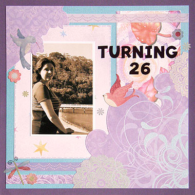
This week I wanted to scrap a photo from my 26th birthday, but instead of choosing a traditional birthday design, I thought I might create something more whimsical and feminine. The Springs Birds & Flower stickers from Karen Foster are so pretty and were just perfect. Here are the results:

Materials Used: Dark purple cardstock (for the background), Metallic blue Bazzill cardstock, American Traditional Glitter paper, Fiskars Purple Stars paper, It Takes Two Leaves paper, purple border stickers from Hunter Leisure, Making Memories Alphabet stickers, a purple pen and Karen Foster Springs Birds & Flower stickers.
There are a few stages involved when re-creating this layout but it is quite simple. Once again, I have used a sketch from 500 Scrapbooking Sketches to guide my design (although I turned it upside down).
Here are some tips to note when re-creating a layout like this.
1. Printing photos in black and white or sepia are a great way to give character to your photos. They also allow you to scrap with whatever colours, patterns and embellishments you want, without having to worry if they will clash with the clothes the subjects of your photos are wearing. In this case, it allowed me to scrap a photo that was heavily dominated by greens and blues with purples and pinks (and of course, my pretty Karen Foster stickers).
2. I cut around the patterns on my American Traditional Glitter paper to create unique corners for my layout. It not only made my page unique, but turning the paper into embellishments gave me the opportunity to highlight the beautiful swirls and flowers on my paper instead of covering them up with photos.
3. I used a purple pen to draw a dashed border around both my purple stars paper and my leaf paper. This gave the designs some distinction so they didn’t get lost in the design. It’s a wonderful, but subtle way to make things stand out without making them the centre of attention.
4. Just because border stickers tend to be 12 inches long, that doesn’t mean you have to use all 12 inches of them. In this layout, I have only used sections of my border stickers to create nice accents at the top and bottom of my page.
5. One of my favourite things to do with stickers is to stick them on white cardstock and cut them out. I don’t always do it, but I find that it’s nice to help some stickers stand out from the page.
Most Karen Foster stickers are made from cardstock so they already have some depth, but their clear range is made to resemble rub-ons and so have very little depth. I love the new line. They really do look like they could be rub-ons – no ridges when crossing layers, no outlines…just beautiful. But on this page, I wanted the pink bird in the middle of the page to stand out, so I stuck it on white cardstock and then cut it out before gluing it in place.
There is a Karen Foster sticker to suit almost every scrapbooking project. They come in lots of different themes and styles. Find the ones that make you smile!
Click Here To View Our Full Range Of Karen Foster Stickers
I’d love to hear your thoughts and ideas for using Karen Foster products on your layouts. Please leave a comment in the comments box below.


I enjoyed reading about your “turning 26″ layout. I haven’t done much with stickers, but can see that it adds an interesting dimension to scrapbooking. I like to know how the page is created.
Regards, Lyn
This is a really lovely layout. Congrats once more. Love, Laura